
The Principles of Design: Seeing the World Through a More Creative Lens
There’s something magical about the way art, architecture, fashion, and even everyday objects come together to make us feel something. That magic? It’s often thanks to the principles of design. These aren’t just fancy art terms, they’re tools we can all use to better understand the world around us, appreciate creativity, and even express ourselves in more intentional ways.
Whether you’re a painter, a fashion lover, a graphic designer, or someone just wanting to make your living room feel less chaotic, understanding these principles can help you create with more heart, flow, and impact.
Let’s take a journey through the seven key principles of design, told in a way that feels real, relatable, and maybe even a little bit inspiring.
Balance: Finding Your Visual Center
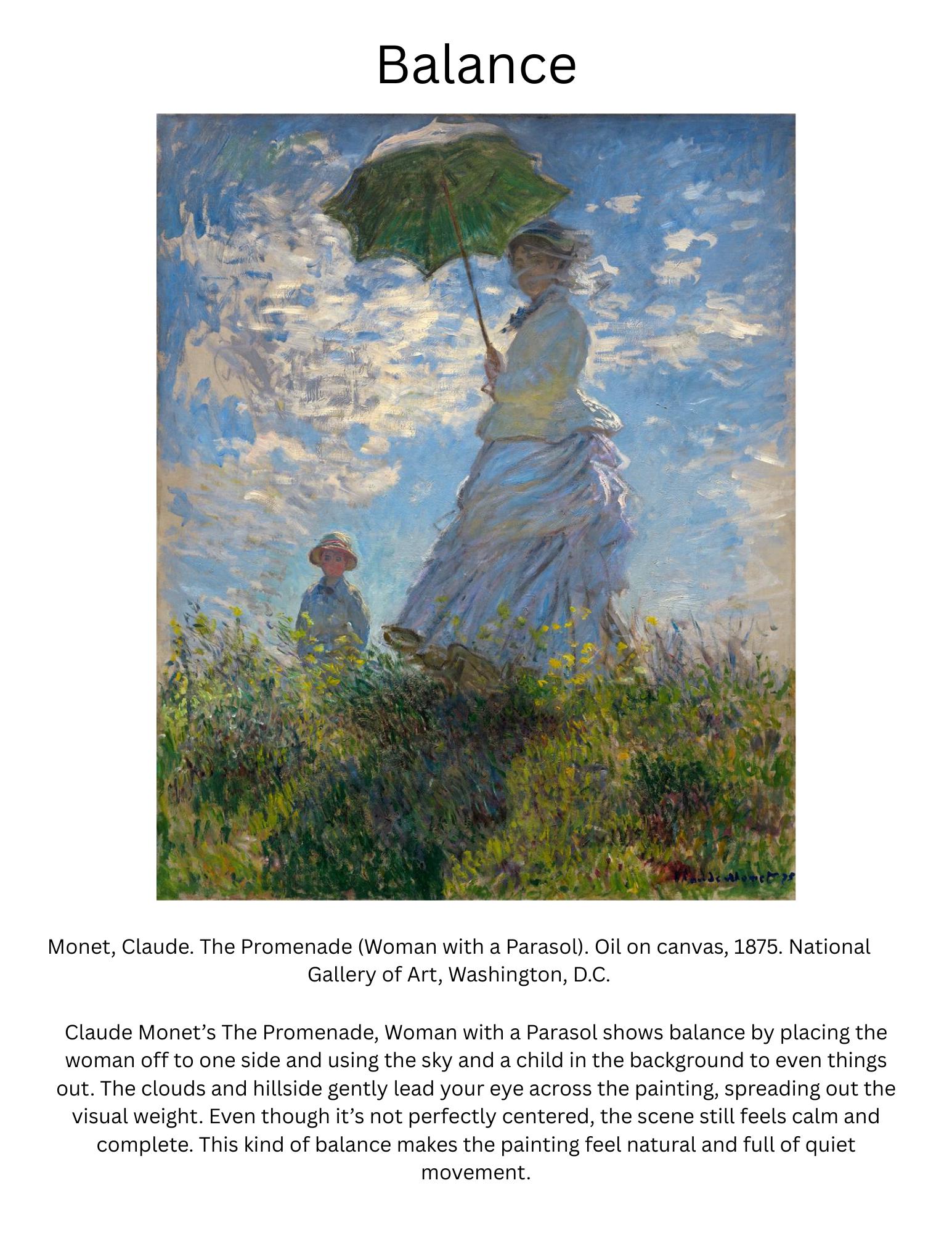
Balance is like that feeling when everything in your life (or at least your outfit) feels… right. It’s the sense of visual equilibrium. It doesn’t always mean everything is perfectly symmetrical—though it can be. Balance can also be informal and off-centered, but still feels… balanced.
Think of the Taj Mahal. Its mirror-like symmetry gives it that serene, timeless beauty. Or Leonardo da Vinci’s Mona Lisa, her centered posture offers a calm balance, but the slight tilt of her head and hands creates a gentle asymmetry that keeps things interesting.
In fashion, imagine the clean lines of a tuxedo. The lapels, the bow tie, the alignment of buttons, classic balance at play. Whether in architecture, painting, or what you wear out the door, balance is that inner “ahhh” of visual peace.
Contrast: Where the Drama Lives
If balance is peace, contrast is excitement. It’s the play between opposites: light and dark, rough and smooth, bright and muted. Contrast is what makes something pop, what draws your eyes exactly where the designer wants them to go.
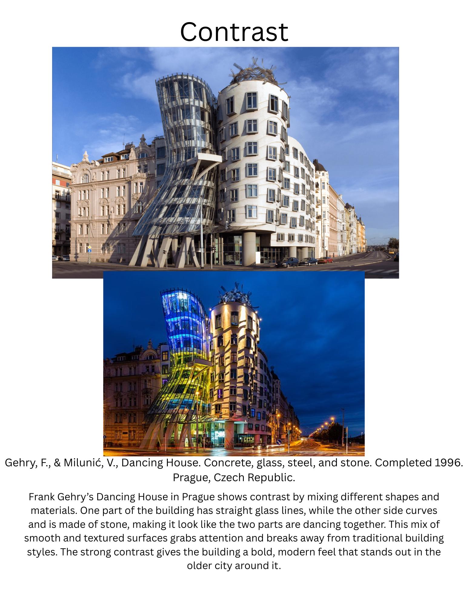
Take Barbara Kruger’s iconic text-based artwork Untitled (Your Body is a Battleground), where stark black-and-white photography collides with bold red text and crisp typography. The sharp contrast between the grayscale image and the vivid red blocks of text creates visual tension that grabs your attention and refuses to let go. Or think of Frank Gehry’s Guggenheim Museum in Bilbao, Spain, where fluid, reflective metal curves stand in dramatic opposition to the building’s grounded, stone-clad forms. Both Kruger and Gehry use contrast as a powerful tool to provoke emotion, highlight key messages, and pull viewers directly into the experience.
In fashion, contrast shows up when you pair something soft and feminine, like a lace dress, with something tough and edgy like a leather jacket. It creates a tension that makes the whole look feel alive and intentional.
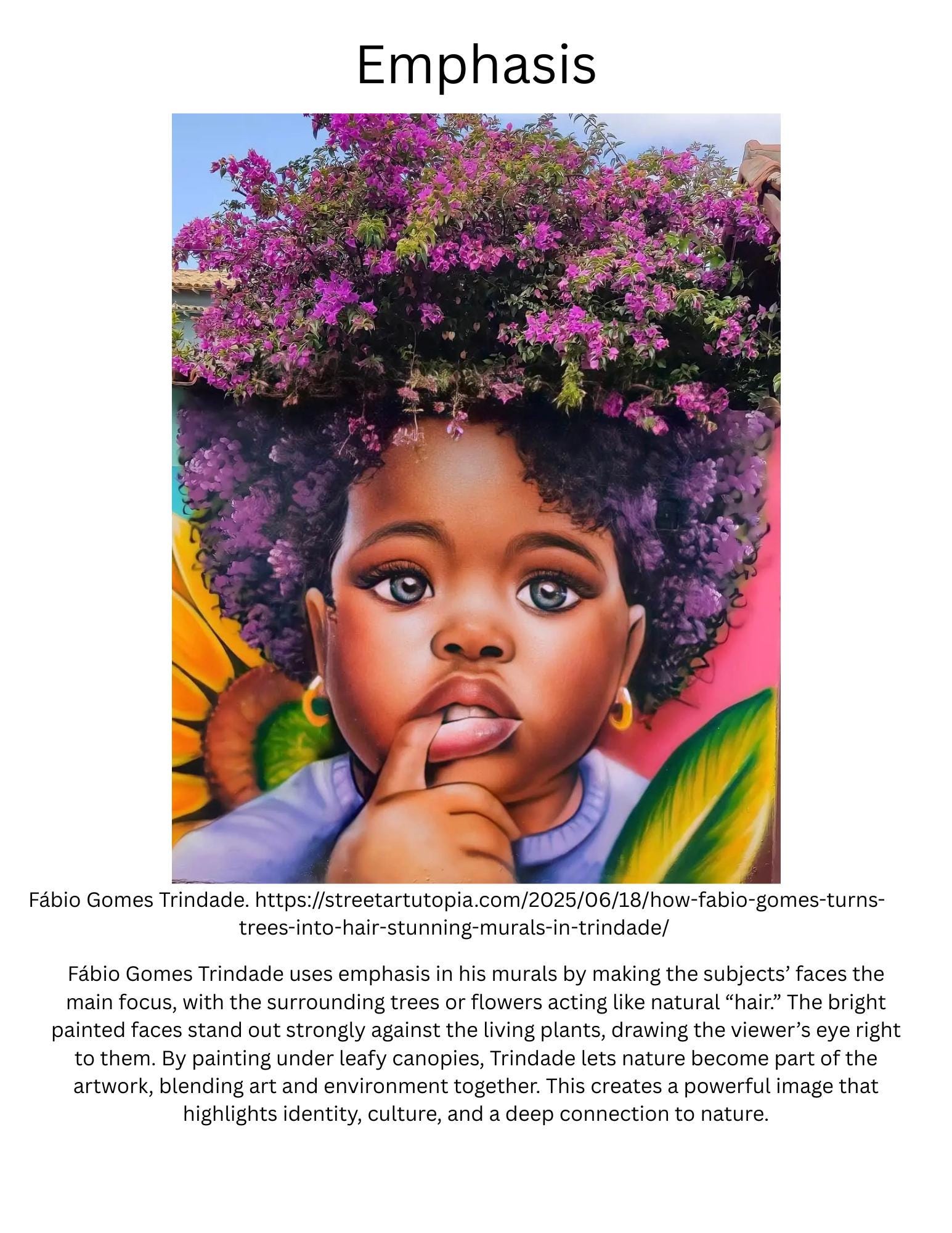
Emphasis: The Star of the Show
Every design needs a focal point, something that says, “Hey! Look at me first!” That’s emphasis. It could be a splash of color, a dramatic line, or a unique shape. Without emphasis, your design (or outfit, or room) risks feeling flat or forgettable.
Caravaggio was a master at this. In The Calling of St. Matthew, light streams across the painting and lands directly on Matthew’s face making sure there’s no doubt where your eye should go first.
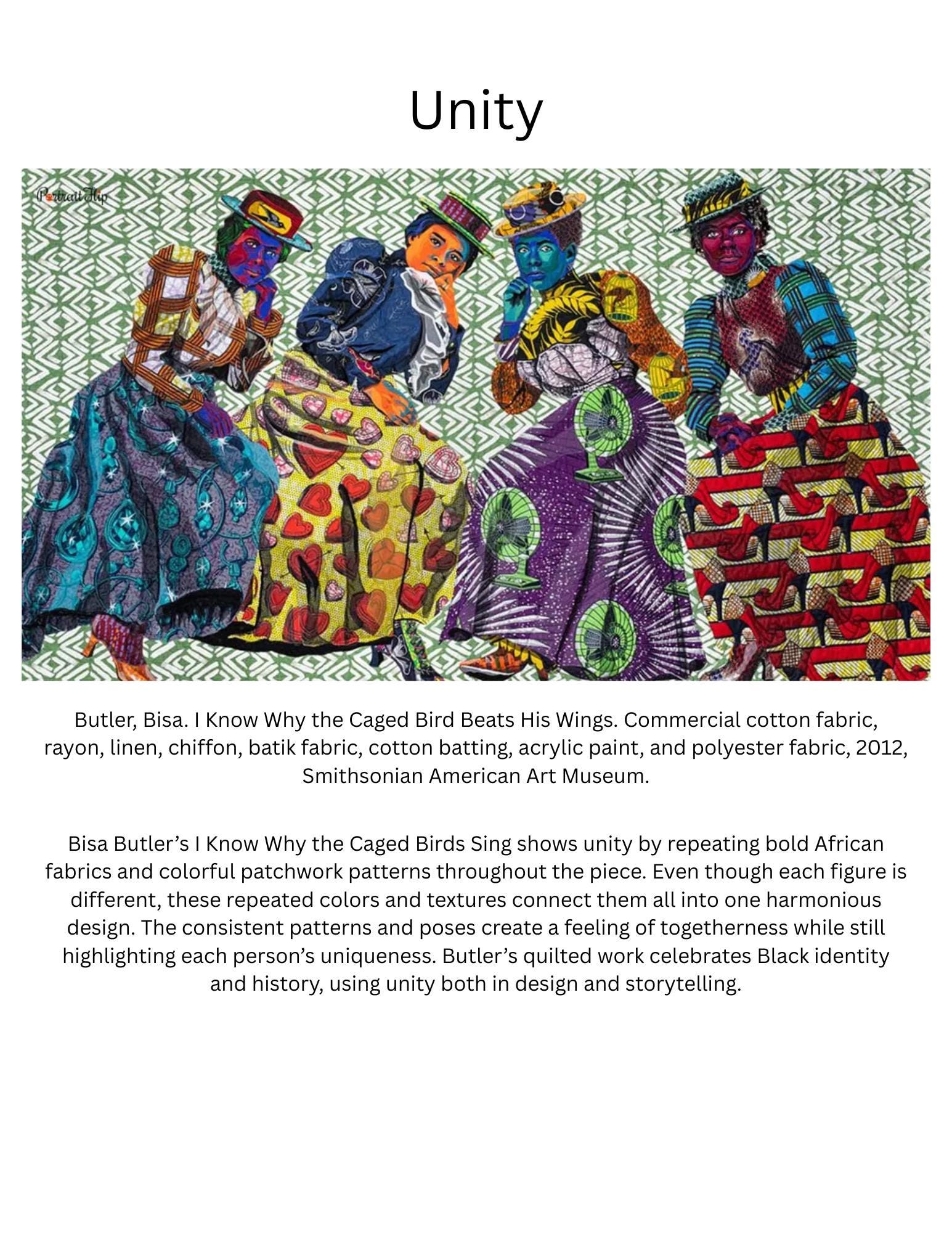
In architecture, think about the rose window at Notre-Dame Cathedral in Paris. Its placement and intricate design pull your gaze upward, inspiring awe. In contemporary textile art, Bisa Butler’s quilted portraits offer a stunning example of emphasis. Her use of vibrant color, bold patterns, and life-sized scale draws immediate attention to her subjects, celebrating Black identity, history, and resilience. Each figure commands focus, framed by intricate background details that support, but never overshadow, the person at the heart of the work.
Movement: Leading the Eye (or the Body)
Movement is all about guiding someone through a visual experience. It’s the path your eye takes across a painting, a building, or even a website. It’s also the literal movement created by fabric, light, or architectural flow.
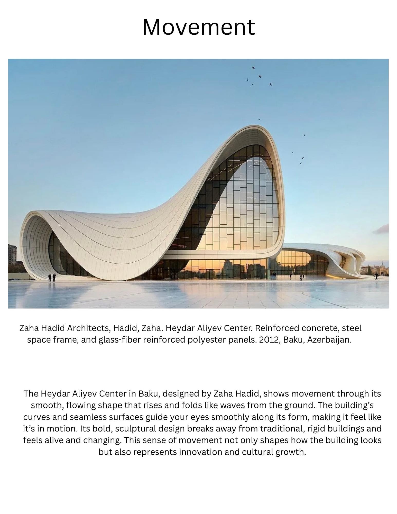
Vincent van Gogh’s Starry Night pulls your gaze in big swirling motions across the sky and down into the sleepy village. Zaha Hadid’s Heydar Aliyev Center in Azerbaijan sweeps visitors through space with flowing curves that seem to defy gravity.
In fashion, movement comes alive with designs like the ruffles of a flamenco dress. As the dancer moves, the fabric responds, becoming part of the performance itself. Movement makes your audience feel something dynamic and alive.
Proportion: The Relationship Between Things
Proportion is about size relationships. It’s how big or small elements feel compared to each other, and how that makes you feel as the viewer. Sometimes, playing with proportion helps exaggerate meaning or create emphasis.
Take Michelangelo’s David. His head and hands are oversized compared to his body, a subtle way of highlighting both strength and intellect. In architecture, the Parthenon in Athens is famous for its use of the golden ratio, a mathematical proportion that naturally feels harmonious and balanced to the human eye.
In fashion, this shows up in silhouettes. Pairing an oversized sweater with fitted jeans creates a contrast in proportions that feels both relaxed and chic. Or think of wide-legged pants balanced with a cropped top visual proportion at work.
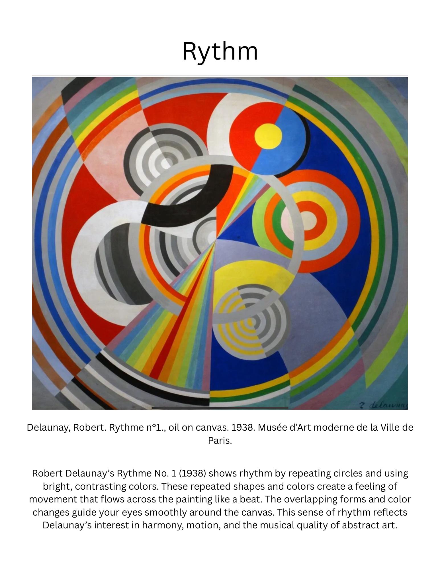
Rhythm: Visual Beat and Flow
Rhythm in design feels like music for the eyes. It’s created through repetition, patterns, and spacing that lead you through the composition at a certain pace.
In architecture, the rows of columns at St. Peter’s Basilica in Vatican City give you a steady, almost meditative rhythm as you walk through. In contemporary art, Yayoi Kusama’s endless polka-dot installations create a playful, sometimes dizzying repetition that pulls you deeper into her world.
Fashion loves rhythm too. You can see it in the bold, repeating chevron patterns of a Missoni knit, where zigzag stripes create a dynamic visual beat that feels both playful and sophisticated. Or in the vibrant, rhythmic repetition found in African wax prints, where bold colors and geometric motifs pulse across the fabric with energy and joy. Rhythm in fashion can be subtle and flowing or loud and full of movement, but no matter the style, it keeps our eyes dancing across the design. It’s that element of repetition that makes a piece feel alive and full of intention, much like the chorus in your favorite song.
Unity: Pulling It All Together
Unity is the glue that holds a design together. It’s what makes everything feel like it belongs in the same family. Without unity, a design can feel disjointed or chaotic.
In interior design, Scandinavian spaces do this beautifully neutral color palettes, natural materials, and minimal forms all working in harmony. In art, Piet Mondrian’s Composition with Red, Blue, and Yellow (1930) is a powerful example of unity. His consistent use of primary colors, bold black grid lines, and balanced composition creates a sense of cohesion that feels both intentional and complete.
Fashion-wise, a capsule wardrobe thrives on unity. A small collection of pieces that all work seamlessly together, so mixing and matching feels effortless.
Quick Recap: The Seven Principles of Design
- Balance: Creating visual stability
- Contrast: Highlighting differences for impact
- Emphasis: Drawing focus to the star element
- Movement: Guiding the eye or body through a space
- Proportion: Playing with size relationships
- Rhythm: Repetition and flow
- Unity: Making everything feel cohesive
Why This Matters Even If You’re Not a “Designer”
You don’t have to be a professional artist or architect to use these principles. Whether you’re rearranging your living room, putting together an outfit, designing a flyer, or even choosing how to post on Instagram, understanding these design fundamentals can help you create things that feel intentional, beautiful, and uniquely yours.
Start noticing them around you. Feel how balance calms you, how contrast energizes you, and how unity makes things feel “just right.” Design is everywhere,you’re already part of it.
Works Cited
Butler, Bisa. I Know Why the Caged Bird Sings. 2019. Art Institute of Chicago, Chicago.
Caravaggio. The Calling of St. Matthew. 1599–1600. Contarelli Chapel, San Luigi dei Francesi, Rome.
Da Vinci, Leonardo. Mona Lisa. c. 1503–1506. Louvre Museum, Paris. Gehry, Frank. Guggenheim Museum Bilbao. 1997. Bilbao, Spain.
Hadid, Zaha. Heydar Aliyev Center. 2012. Baku, Azerbaijan. Kruger, Barbara. Untitled (Your Body is a Battleground). 1989. Broad Art Foundation, Los Angeles.
Kusama, Yayoi. Various Polka-Dot Installations. Ongoing. Various Locations.
Michelangelo. David. 1501–1504. Galleria dell’Accademia, Florence.
Mondrian, Piet. Composition with Red, Blue, and Yellow. 1930. Gemeente
Museum Den Haag, The Hague.
Parthenon. c. 447–432 BCE. Acropolis, Athens, Greece.
“Design Principles.” Principles of Design in Visual Art, The Art Story, www.theartstory.org/definition/design-principles/.
Robin, William. Fashion Design Fundamentals. Thames & Hudson, 2023.
Van Gogh, Vincent. The Starry Night. 1889. Museum of Modern Art, New York.
Here are some examples from a project i did for a class: